The product page is where a visitor decides to buy. They cannot hold the item, so the page has to answer every question the product would answer in a shop. Good product pages are not complicated. They are complete, clear and honest. This guide explains what each page needs.
1. Photographs that show the product
Customers rely on photographs more than on anything else. Show the product from several angles, with the main image large and sharp. Add a close-up of important details, an image that shows scale, and, where it helps, the product in use. Keep the background, light and crop consistent across the store. The guide to the product photo checklist covers shooting, and product photo retouching covers editing.
2. A clear title
Name the product the way customers would describe it. Put the key words first: what it is, the type, the material. Avoid long strings of keywords. A clear title helps both shoppers and search engines.
3. The price, with no surprises
Show the price clearly, and say what it includes. If there are variations that change the price, such as sizes or materials, show it when the visitor chooses. Be honest about taxes and shipping, because unexpected costs at checkout are one of the main reasons people leave.
4. A description that helps decisions
Start with a short paragraph about who the product is for and what it does. Follow with the facts people look for: materials, dimensions, weight, care instructions and what is in the box. Use short lists for specifications. Write in plain, specific words.
5. Variations that are easy to choose
Sizes, colours and options should be easy to pick, with clear labels. Show which options are out of stock. If sizes vary between brands, add a size guide. A confusing selector costs sales.
6. Shipping and returns, on the page
People want to know how long delivery takes and what happens if they need to send something back. Put the key points on the product page, with a link to the full policy. Clear, fair returns reduce hesitation.
7. Reviews and proof that are real
Genuine reviews are powerful, and fake ones are harmful. Show reviews you have actually collected, and show how many there are. If you are new, build reviews by asking real customers, and meanwhile show other proof: your story, your materials, photographs of the making.
8. Trust signals
Show secure payment, contact details and a way to reach a real person. A short line about who you are and where you are based reassures buyers. Keep the design calm and consistent with the rest of your brand.
9. A strong, visible action
The “Add to bag” button should be easy to see and use, and it should say what it does. On a phone, keep it within reach of a thumb. After the visitor adds the item, show a clear confirmation and a way to continue or to check out.
10. Suggest what goes with it
Related products, “complete the look” and “customers also bought” sections help people discover more of your store. Keep suggestions relevant, and limit them to a few.
11. Make it fast and mobile-ready
Most shoppers browse on phones. Use properly sized images, avoid heavy scripts and test every step on a phone. A slow product page loses buyers before they read a word.
Examples
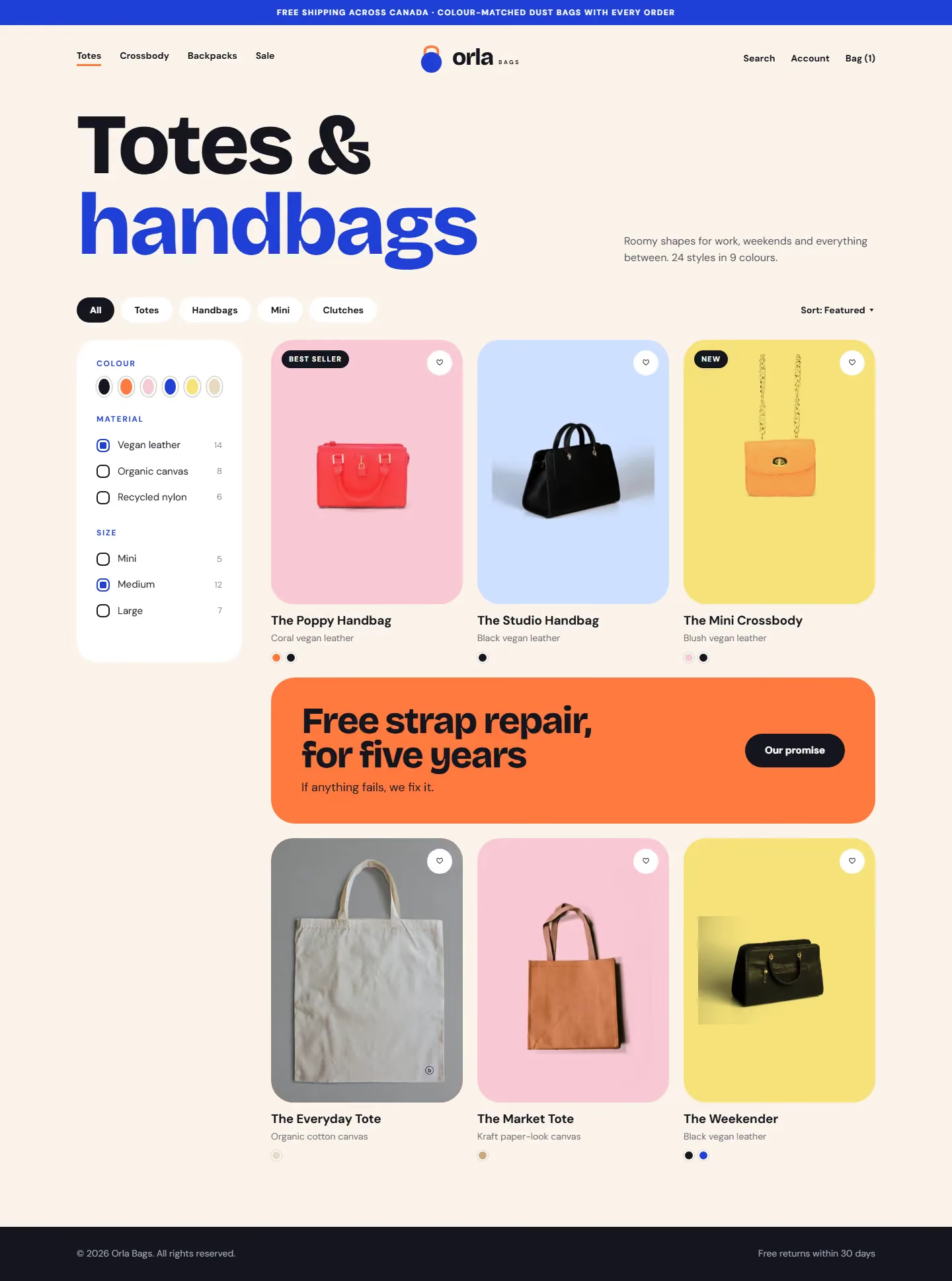
The design portfolio includes online store pages for several kinds of business, including an auto parts store, a bag store and a shoe store. Open one to see how product pages are organised for different customers.
Related guides
For a single page that sells one offer, read the landing page checklist. For the wider website, see the website checklist for a local business.
Want a store designed around your products?
Tell me what you sell and how customers buy. I reply with questions, a plan and a quote. You can request a design quote here, read about online store design, and call, email or message me using the details at the bottom of this page.