A logo and a set of colours are the first things a customer meets. They do not need to be clever. They need to be clear, memorable and suited to the business. This guide walks through the choices in a sensible order, and points out the mistakes that cost money later.
Start with the business, not the logo
Before you look at shapes, answer a few questions in writing. Who are your customers? What do you want them to feel when they meet you: calm, excited, trusted, amused? What makes you different from the three nearest competitors? Which three words describe your business? A logo is a short answer to these questions.
Look at your competitors
Collect the logos and colours of businesses like yours, and see what they share. If every competitor uses blue, blue is expected, and choosing it makes you fit in. Choosing a different colour makes you stand out, but only if it suits the business. Decide on purpose.
Keep the logo simple
The best logos are easy to recognise at a glance, easy to remember and easy to draw. They work at the size of a social media icon and on a shopfront. Avoid fine detail, long lines of text and effects such as gradients and shadows, which print and shrink badly. A good test is to squint at the logo, or to draw it from memory.
Check that it works everywhere
Look at the logo small, at 20 millimetres wide. Look at it in one colour, in black and in white. Look at it on a dark background and on a photograph. Look at it as a circle, as an icon, as a stamp. A logo that works only in one place will cause problems every time you need it somewhere else.
Choose a small palette
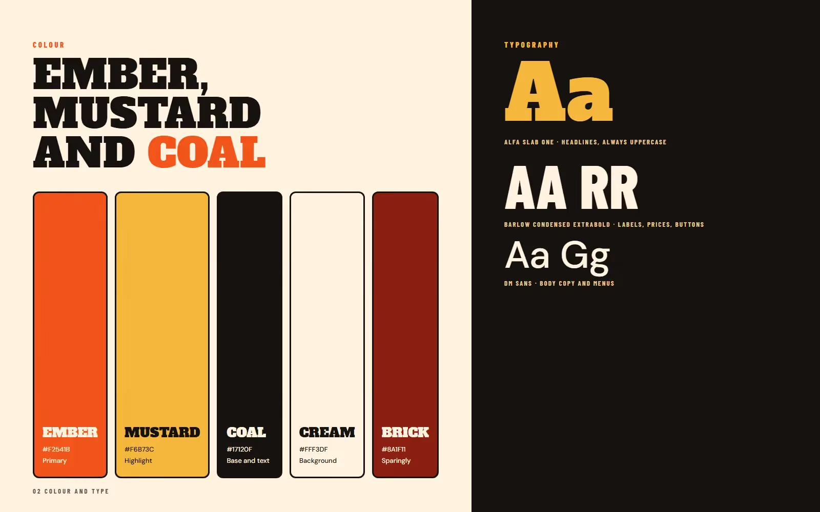
Three to five colours are enough. One main colour that people will associate with you, one or two supporting colours, a dark colour for text and a light colour for backgrounds. Record each colour’s exact code, so a printer and a web designer use the same one.
Check contrast
Colours must be readable. Text needs enough contrast against its background, and a ratio of at least 4.5 to 1 is the usual standard for body text on the web. Light grey on white, or yellow on white, looks fashionable and is hard to read. Test combinations with a contrast checker before you commit.
Pick two typefaces
One for headlines, one for text, is plenty. Choose faces that are readable, have the weights you need and have a licence that allows commercial use. Pair a distinctive headline face with a calm, neutral text face. Avoid using more than two, because variety looks like indecision.
Avoid trends that date quickly
A logo you love this year may look tired in five. Choose shapes and colours that fit your business, not the fashion of the moment. Look at how long the logos of businesses you admire have lasted.
Check that the name and mark are free to use
Before you invest, search for businesses with similar names and logos in your field and region. A local business can be asked to change a name that is too close to another. For anything important, take advice on trademarks.
Get the right files
Ask for the logo as a vector file, which scales to any size, and as pictures for web use. Ask for versions in colour, in black and in white, and for a square icon version. Ask for the colour codes and the typeface names. Keep the files together in one folder.
Write it down
A short brand book records the decisions: the logo and its clear space, the colours, the typefaces and a few examples of how not to use them. See what a brand book is. Share it with everyone who makes materials for you.
Related guides
To apply your brand to print, read how to plan a tri-fold brochure. To apply it online, see the website checklist for a local business and the landing page checklist.
Want a brand designed for your business?
Tell me about your business and how you want to be seen. I reply with questions, a plan and a quote. You can request a design quote here, see brand identity and brand book design, and call, email or message me using the details at the bottom of this page.